Alerts
Components added in the flow of your page body can be selected from the WYSIWYG 'styles dropdown'.
You can choose from the following component styles:
- Alert info
- Alert warning
- Alert failure
- Alert success
- Callout primary
- Callout success
- Callout danger
- Callout teal
- Callout carbon
- Callout yellow
- Highlight
The available style options may appear different to those listed on this page.
Alert info
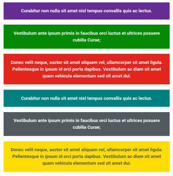
Apply the alert info style to make a piece of content stand out. This is usually a key piece of information.
This could be temporary information, such as an upcoming closing date for an application. It could also be more permanent information, such as telling someone that they have to submit a key piece of information.
Alert warning
Only use the alert danger box when you need to warn users about something important, such as legal consequences of an action, or lack of action, or if someone is in danger. It can also be used when a user has not completed an action correctly – make sure you explain how they can rectify the issue.
Alert failure
Use the alert success box to give feedback to a user when they have failed to complete an action or a transaction.
Alert success
Use the alert success box to give feedback to a user when they have completed an action or a transaction.
Callouts
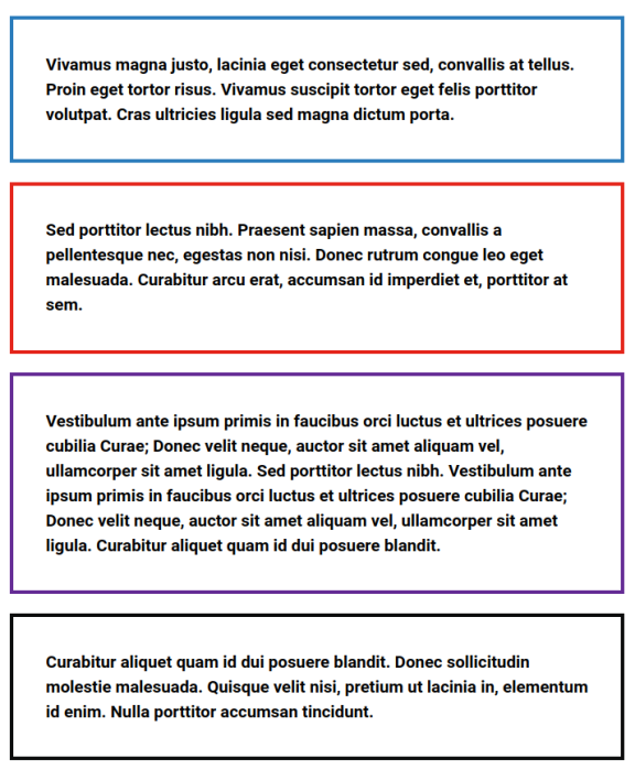
There are six varieties of callout available in the default text format. Most Councils will create a set of in-house rules about when they will be applied.
- Callout primary
- Callout success
- Callout danger
- Callout teal
- Callout carbon
- Callout yellow
Remember that these provide visual styling only and the information provided by the visual styles should also be available in text to make this information avail able to all users.
Highlight
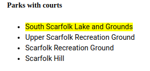
A style component used to highlight a piece of text or a link on a page so it stands out.